With brilliant WordPress and other themes being available these days, its easier than ever to get a website that looks good. But is this really how we should think about web design? Just in terms of whether it looks good?
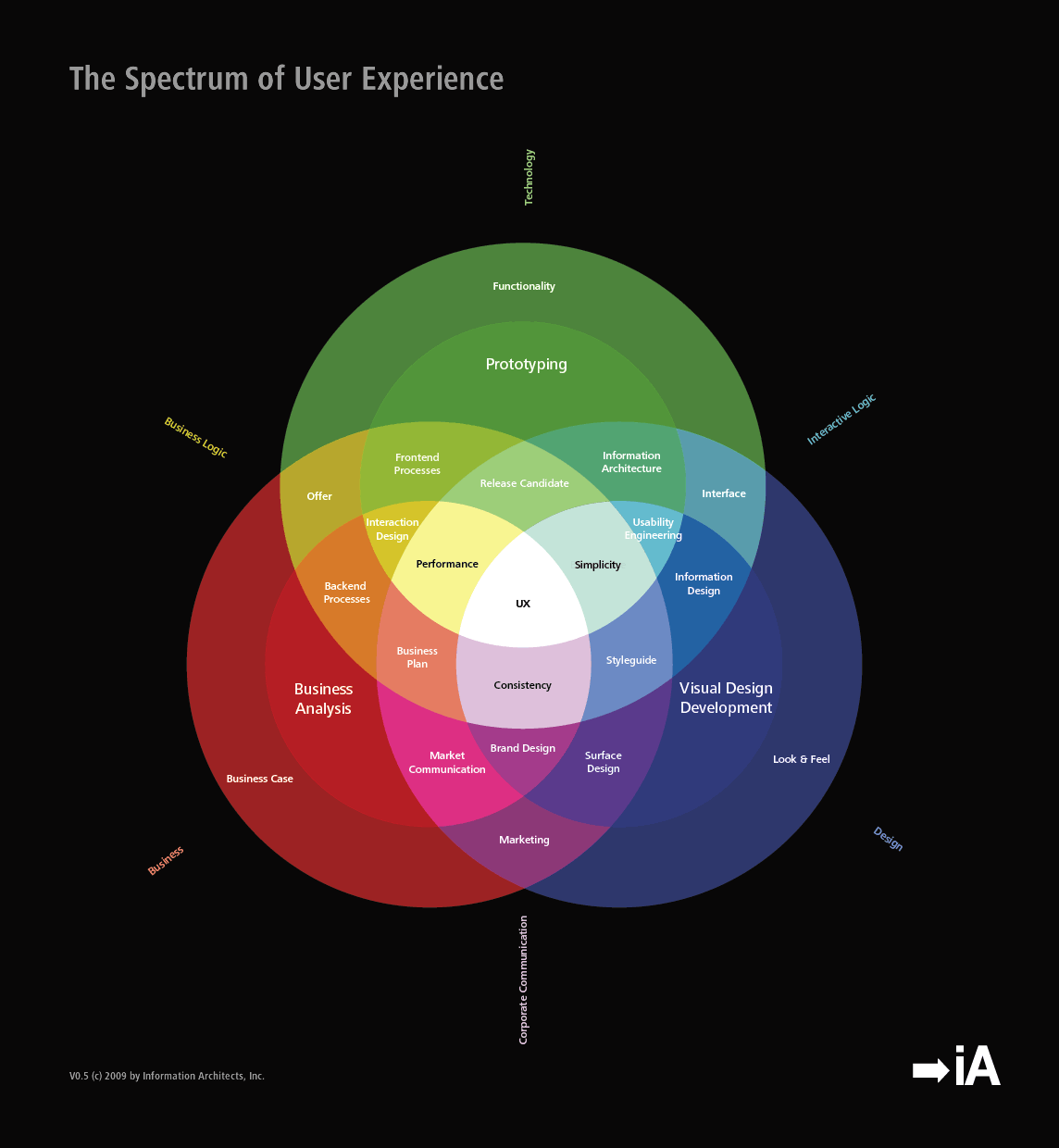
Steve Jobs said ‘Design is not just what it looks like and feels like. Design is how it works.’ In the context of web design, this means we should think just as much about how easy and effective a website is to use, as how pretty it is. User Experience (UX) design is all about recognising that people have a holistic experience when they use a website or an app, and that this experience is affected my many different things, and ken be either positive or negative. UX designers draw on psychology as well as design theory, to craft websites that people find simple and useful, before thinking about whether or not they are pretty. UX designers know that someone’s experience when using a site is more influential on whether they will come back, or achieve their goals, than how good looking the website is.
Put yourself in a user’s shoes
So when you think about how to design your website, or change an existing design, always remember to place yourself in the shoes of a realistic visitor to your site. What does this mean?
- Find out where your visitors are coming from, using Google Analytics (link to other post). If most are coming from search engines, chances are they have no idea who you are, and the first contact they have with your business is landing not on your homepage, but on a deeper page on your site.
- They don’t care about your business or your brand, they only care about achieving the task they set out to do – this could be buying a product, finding out some information, or finding directions to a restaurant for example.
- This visitor, on average, is unlikely to be a tech wizard. They use the web to do things easier, but their not a geek who knows about flashy new geeky things.
- They could be visiting your site on any one of a range of different devices. It could be a huge screen on the desk of a designer in Cape Town, or a small BlackBerry screen on a packed taxi in Soweto.
- Not everyone has brilliant eyesight, or good language skills in the language you have written your website copy in
- Again, no one cares about your business or your brand, and its no effort at all to close a browser tab and search again, or visit another website. You have only a couple of seconds to communicate to someone that your website is going to give them what they’re looking for.
Communication is key
Following on from that last point – before you even get to the job of designing what your website actually does, whether it is playing videos, or selling laptops, the first thing you need to consider is telling your visitors this. When a user lands on any page, they should within a second know what your website is, what it does, and whereabouts on the website they are. This is more important than any brand colour decisions, more important than your logo, and more important than whether to use a stock image of a pretty girl or a fast car. Use a tagline, page titles that are easy to read, a simple navigation menu that shows here someone is, and perhaps breadcrumbs as well (google that if you’re not sure what it is).
A good guideline to follow is always to have only one main action that someone can take on a page, and never lose sight of this when designing a page. It could be the reading of an article, or getting in touch via a contact form, but whatever it is make sure that as soon as the page loads (for someone who has never heard of you before, and doesn’t care about your website in particular) they can see exactly where to go and what to click.
Layout first, prettiness second
When a lot of people think about design they think about colours, and gradients, and graphics. From what we’ve seen so far though it is layout that is more important, and layout that you should think about before getting to those other things.
Layout is simply where different sections of your website are positioned. Where is the menu? Where is the ‘Buy Now’ button? Where are the social sharing buttons? Is there a sidebar? Why? Sketching this out on a piece of paper first is a great way to think about it properly, and something that the best UX designers do. You can sketch a simple layout in seconds, and then approach it imagining yourself as a random visitor. You can start to see immediately if you are leaving things out, or if you should shift some things around. Ask yourself the kinds of questions they would be asking: ‘How do I get in touch with these people?’, ‘How can I see all of the phones they sell?’, ‘How do I get back to the homepage?’ and so on.
Don’t make me think!
This is the title of a famous UX book, and it should also be the war cry of anyone thinking about web design. When you are making any design decision, whether it is a big layout decision, or the colour of your buttons, or the size of your page titles, always remember that you need to try and NOT make your visitors think at all. This means that however you use colour and graphics and text, it should always be to make things easier and more obvious for the person using your website.
User Experience design, almost shouldn’t have a special name like User Experience design. It’s really just good design thinking, full stop. Next time you approach a web design question, whether it is yourself, or with a web designer, always forget yourself and your attachment to your brand or business, put yourself in the shoes of a website visitor who knows nothing about you, and make things easy for them. Don’t make them think.